
Have you ever visited a website and completely ignored the adverts down the sides without even realising it? It’s not you; it’s your brain protecting itself from overstimulation. This phenomenon is known as Banner Blindness, and it doesn’t only happen in the digital world.
We’re so saturated with identical logos on pens, notebooks and uninspiring T-shirts that our brains simply filter them out. So, the solution isn’t to invest in more and more merchandise, but to do it the right way.
In this article, we’ll explore the aforementioned phenomenon of Banner Blindness and one game-changing way to avoid it: placing your brand in unexpected, unusual and original places.
· What is Banner Blindness, and why is it harming your merchandise?
Before diving into the different ideas for places where you can customise your corporate gifts, let’s take a closer look at what Banner Blindness actually is.
Also known as banner blindness, it is a psychological phenomenon in consumer behaviour within the digital environment that has been widely documented since the late 1990s, following pioneering usability studies such as those by Benway and Lane (1998). Essentially, it refers to our brain’s ability to consciously or unconsciously ignore any element that resembles advertising.
When you visit a website to read an article, your eyes automatically skip the banner adverts down the sides because your brain already knows that’s not where the valuable content is. However, in recent years, this phenomenon has moved beyond the digital environment and into the physical world.
We live in an environment saturated with commercial messages. When someone receives a pen with a huge logo printed along the side, their brain activates its ‘anti-advertising filter’. They’ll put it in a drawer and perhaps use it, but they’ll never really notice it. Your brand becomes invisible.
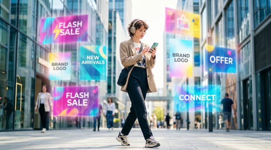
Why does this happen? As research into selective attention and cognitive overload has shown, the human brain constantly looks for ways to process information efficiently. When an object features a logo exactly where we expect a logo to be, our brain can quickly categorise it as advertising and filter it out as background noise. That creates a new challenge for brands: how can we make promotional gifts capture attention and strengthen brand awareness in the minds of users?
· The antidote: 5 creative and original places for your message or logo
If the problem is that we’ve learnt to ignore anything that looks like advertising, one way to regain attention is to break with our expectations of where a brand should appear. The logo doesn’t always need to be bigger or more eye-catching. Sometimes, simply placing it somewhere unexpected is enough.
Here are some ideas to help you do just that:
1. Inside the product
Why limit branding to the outside of a product? Placing a message in an area that is only discovered when the item is being used introduces a small element of surprise.
A great example is this promotional mug, which can also be printed on the inside. The message can remain partially hidden and gradually reveal itself as the person drinks, turning an everyday object into a slightly more unexpected experience.
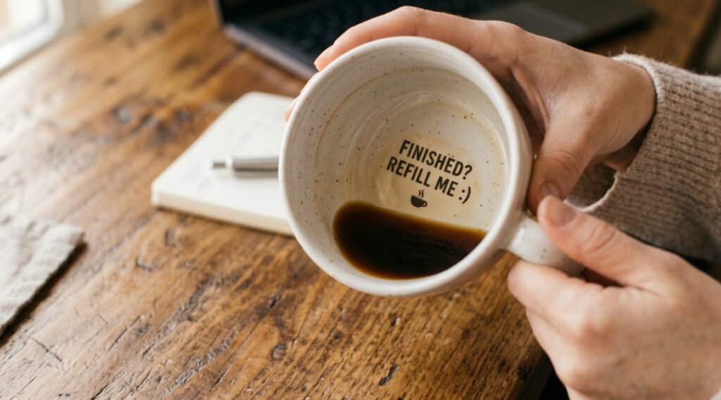
This type of placement works particularly well for short messages, subtle brand touches or graphic elements that complement the main logo.
2. On a label integrated into the product itself
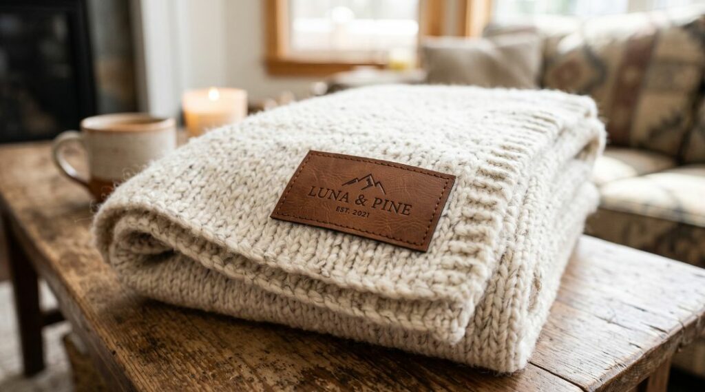
Another option is to avoid the main surface of the product and move the branding onto a label that forms part of its design.
For example, on this personalised blanket, the logo can be placed on a patch directly onto the blanket. Rather than appearing as an advertising element added afterwards, the branding feels integrated, as though it were part of the product’s original finish.
Something similar can be achieved with certain tubular lanyards, such as this design, where you can choose to place the branding on a label or directly onto the cord itself.
3. Making use of the object’s entire shape
Branding doesn’t always have to be confined to a small rectangle reserved for the logo. Some products allow you to use a much larger portion of their surface as a creative canvas.
A good example are these highlighters in a hand-shape, whose design offers far more visual possibilities than the conventional side of a pen.
In these cases, the product itself can become part of the creative concept. Colours, shapes and the printing area work together to make the branding harder to overlook.
4. On the wrapping or packaging
Sometimes, the most interesting place to put your brand isn’t even on the product itself. This is particularly common with food and confectionery products.
For example, with this personalised jar of sweets among many other products, the jar itself becomes the advertising medium. And with products such as this personalised tin of mints, virtually the entire tin can be used to communicate your message.
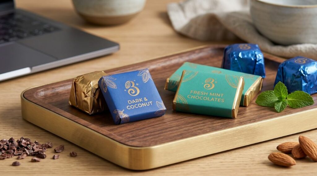
There is also an advantage here: before reaching the product itself, the user has to interact with the packaging. The brand message therefore becomes part of the experience: it is present when the gift is opened, handed out or consumed.
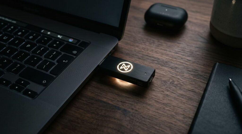
5. Making the branding itself light up
Another way to surprise people is to focus on how the logo appears, rather than where it is placed.
A clear example is this personalised torch, where the engraving can be lit when the device is in use. The brand stops being a static element and takes centre stage precisely when the user interacts with the product.
This small effect completely changes how the branding is perceived: instead of seeing yet another logo printed on a surface, the user discovers a personalised detail that is activated through the use of the gift itself.
· Which one should you choose? A summary of the options based on our recommendations
To help you decide which of these five options best suits what you want to achieve with your next campaign, here is a quick summary:
| Objective | Recommended option |
|---|---|
| Surprise people when they use the product | Interior branding |
| Create a premium image | Integrated label |
| Achieve a strong visual impact | Full-surface printing |
| Enhance the delivery experience | Personalised packaging |
| Create a technological effect | Illuminated logo |
· Conclusion: A different approach to personalisation
Ultimately, combating Banner Blindness in promotional merchandise does not necessarily mean designing increasingly extravagant products. It is about breaking patterns. Changing where, on what, or when the brand appears may be enough to make the user pay attention to it again.
Because when everyone places their logo in the same spot, perhaps the best way to stand out is simply to put it where nobody expects to find it. The secret is not in the product, but in how it is personalised!