Famous Logos and Their History
Life is full of logos: on the bottle of water we drink, on the laptop we use for work, on the bus shelter we wait at every morning… There is an endless variety of colours, formats, and designs. However, many of us have often wondered: why does this logo look the way it does?
There are countless interesting stories behind these images. We will explain the history behind some of the world’s most famous logos.
A Brief History of the Logo
It was not until the 19th century that logos, as we know them today, truly began to exist. Manufacturers of certain products used small marks to distinguish who had produced them. From that point onwards, logos gradually became more sophisticated in order to attract consumers’ attention. In fact, the Trade Marks Registration Act was introduced in the United Kingdom in 1876.
During the 20th century, companies realised that they needed to stand out from the competition. To achieve this, it became essential to create logos that fully identified their products. Over time, designs became increasingly original, to the point where businesses began hiring specialists to develop them.
Today, logos play a crucial role in communicating a brand’s values. They are considered so important that many companies periodically redesign them depending on their goals and market positioning.
Logos and Their Stories
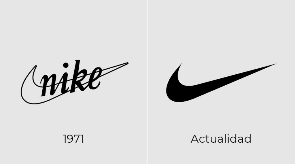
Nike
As you probably know, the brand’s name refers to the Greek goddess of victory, Nike. To create the logo, the company invited 35 graphic designers to submit concepts representing movement. The proposal created by Carolyn Davidson was eventually chosen, despite the initial reluctance of Phil Knight, the company’s founder.
The design was named the “Swoosh” and represents one of the wings of the goddess Nike. Carolyn Davidson was paid only 35 dollars for the logo at the time, although Knight later rewarded her with a considerable amount of company shares.
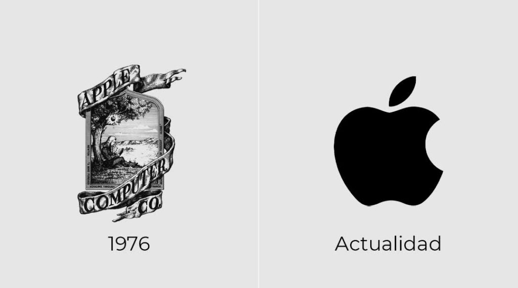
Apple
Apple’s original logo was far more complex than the one we know today, as it depicted the scene of Isaac Newton at the key moment of his greatest inspiration. Steve Jobs considered it too complicated and commissioned a redesign, which led to the creation of the famous bitten apple logo.
Originally, the logo featured colourful stripes instead of the grey or black version used today. This was intended to highlight the computer’s ability to display colour graphics. Years later, the only redesign it received was the adoption of a single, more serious and professional tone.
As for why the apple has a bite taken out of it, there are several theories. One claims it was a tribute to the famous mathematician Alan Turing, who died after eating a poisoned apple. Another suggests it was a play on words between “bite” and “byte”, the computer term for a unit of information. The final — and perhaps most plausible — explanation is simply that the bite was added as a design detail to ensure the apple would not be mistaken for a cherry.
Coca-Cola
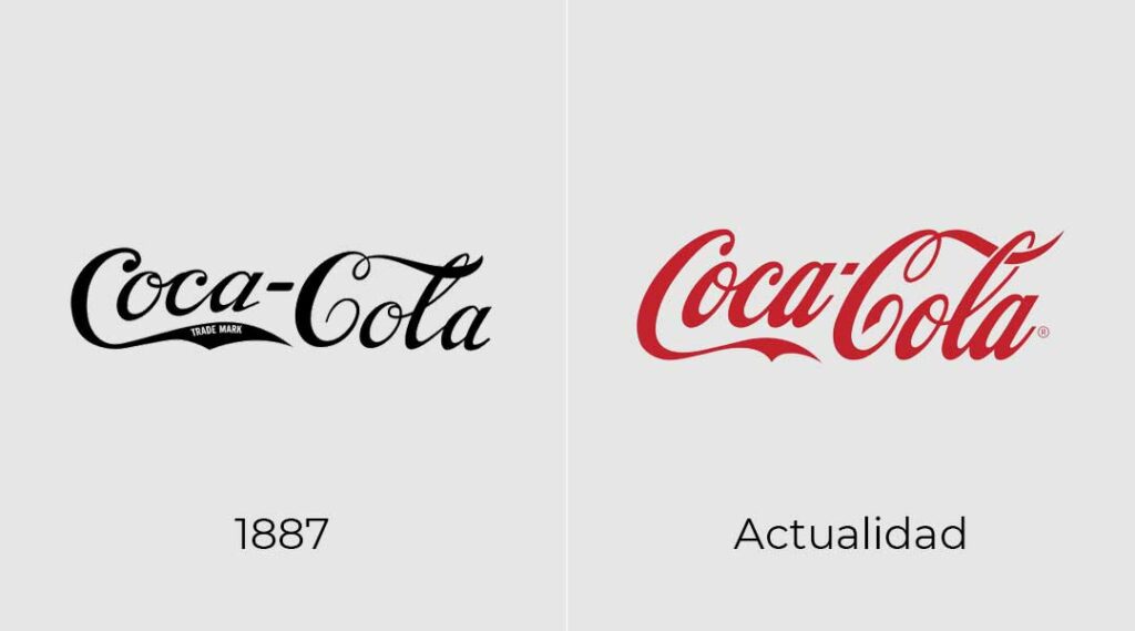
The Coca-Cola logo is one of the few that has remained almost unchanged since its creation. Frank Mason Robinson, the company’s accountant, was responsible for designing it. From the very beginning, he was certain that he wanted to create the now-famous flowing “C” lettering.
As for the classic red colour, it was chosen because it symbolises “strength, passion, love, and energy”. However, it was only years later that the company decided to combine it with white, a colour associated with “purity, youth, and nobility”.
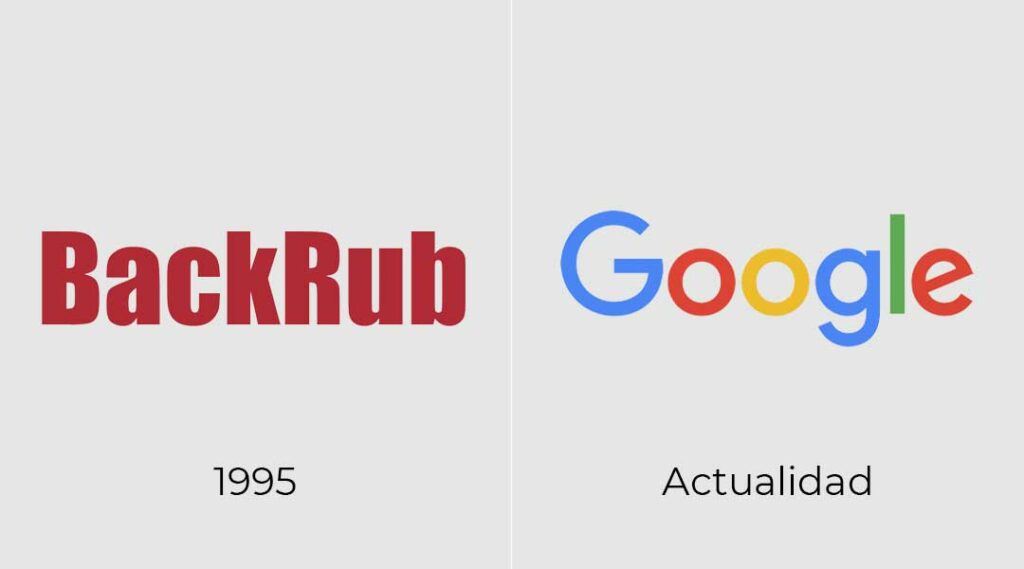
Google’s very first name was “BackRub”, as the search engine originally found pages through backlinks. Later, the name was mistakenly changed to “Google!” due to confusion with the word “googol” — a mathematical term referring to an enormous number — while the exclamation mark was added in imitation of Yahoo!. The idea behind the name was that the search engine would quickly provide users with hundreds of “googols” of results.
Sergey Brin, one of the company’s founders, used the image-editing software GIMP to create the original logo design, which was not very different from the one we recognise today.
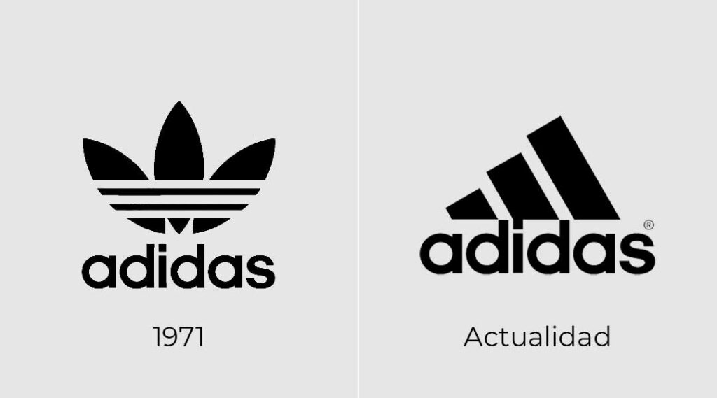
Adidas
Originally, the logo featured a three-leaf trefoil symbol intended to represent good luck. The trademark was initially owned by Karhu Sports, but due to the difficulties caused by the Second World War, the Finnish sportswear company sold the design for 1,600 dollars and two bottles of whisky.
Later, the logo was redesigned while still retaining the iconic three stripes, this time arranged in a triangular shape. These stripes were said to symbolise the company’s three major sales regions: Asia, North America, and Europe. Even so, the original trefoil logo was never completely abandoned and is still used for certain collections and special occasions.
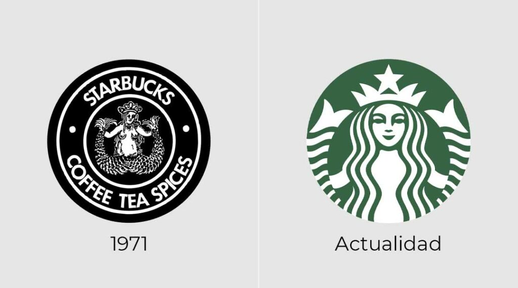
Starbucks
The Starbucks logo was created in 1971, and its inspiration was discovered almost by chance when the founders came across a Nordic woodcut depicting a twin-tailed mermaid, or siren. Terry Heckler was responsible for turning that idea into the company’s logo, which originally featured the siren’s full body.
In 1987, the design was partially modified to make the image less revealing. Later, in 1992, it was simplified even further, resulting in the iconic version of the logo that we recognise today.
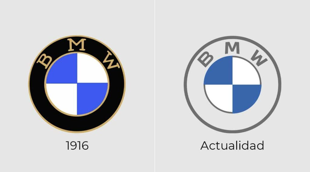
BMW
The famous car manufacturer has had a logo that has remained almost unchanged since its creation in 1916. The use of blue and white quadrants within a black circle is far from accidental, as the design combines several elements from the company’s history.
On one hand, the blue and white pattern comes from the flag of Bavaria, the region where the company originated. On the other, the black outer circle was inherited from the logo of Rapp Motorenwerke, the original company before it changed its name to BMW.
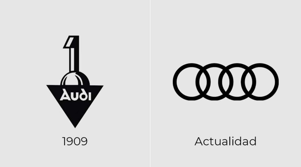
Audi
The famous four rings did not appear until 1932, even though the company had been founded in 1909. The original logo was inspired by the Art Nouveau movement, but years later Audi merged with DKW, Horch, and Wanderer in order to reduce manufacturing costs during a period when the economy was suffering heavily.
It was after this merger that the four-ring design was introduced, symbolising the union of the four companies and marking a completely new beginning for the brand.
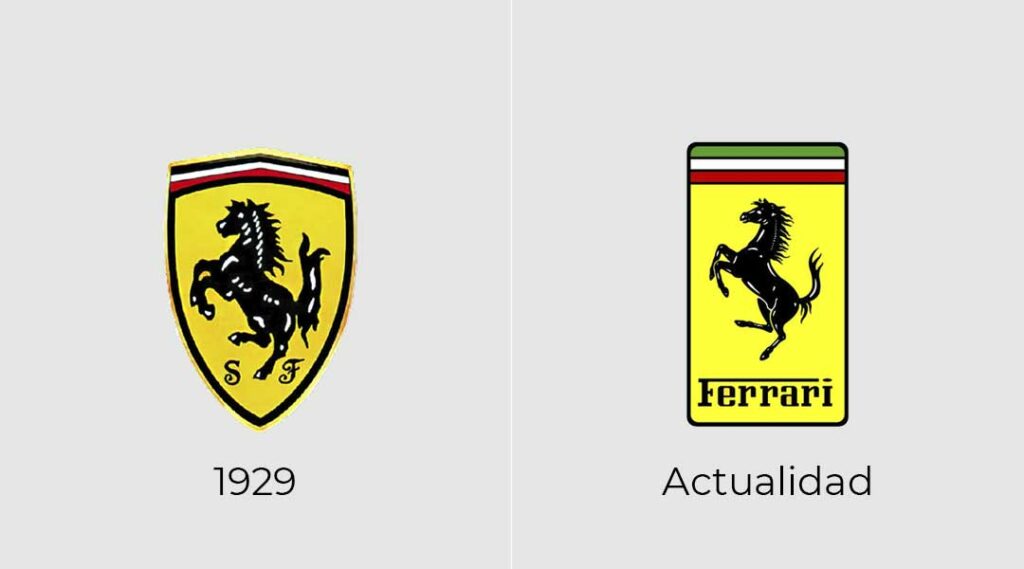
Ferrari
The story behind Ferrari’s logo is very different from the others we have seen so far. Francesco Baracca, an Italian count and pilot who fought during the First World War, painted a horse on his aircraft. His mother, Paolina Baracca, was greatly impressed when she met racing driver Enzo Ferrari and asked him to display her son’s horse emblem on one of his cars.
The horse was originally red on a white cloud, but Enzo Ferrari decided to paint it black on a yellow background as a sign of mourning for the aviators who had died during the war.
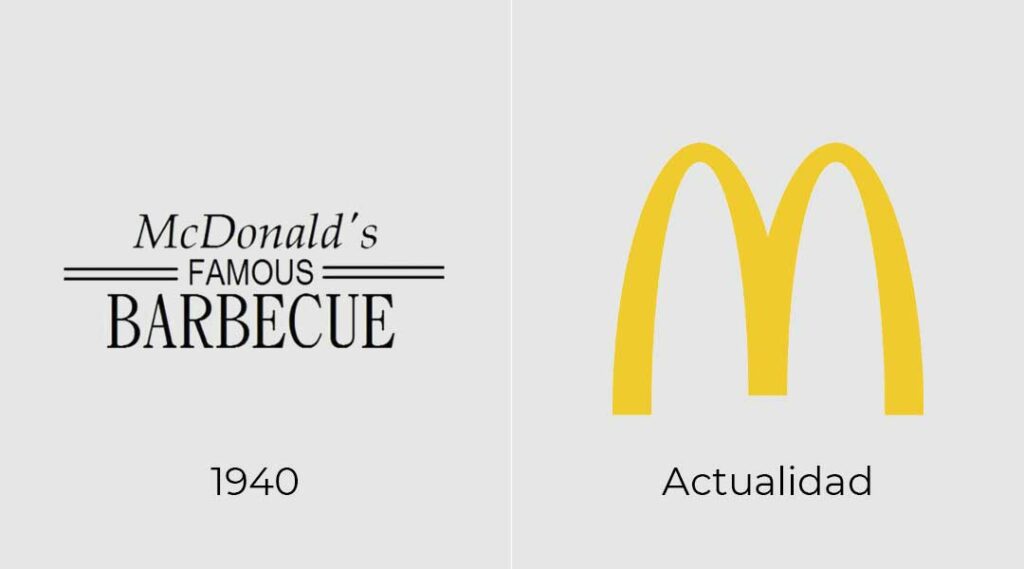
McDonald’s
Although it may seem that the famous “M” in McDonald’s is simply the first letter of the brand name given a distinctive shape, there is actually a deeper story behind the design.
The logo is known in America as the “Golden Arches”. While the logo itself has been redesigned several times over the years, the arches have remained unchanged since 1968, becoming a central part of the company’s identity and making the brand instantly recognisable almost anywhere in the world.
The idea originated during a redesign of the company’s restaurant architecture in 1952, when large yellow arches were installed on both sides of the buildings’ exteriors. Years later, these arches became a permanent feature of the logo itself.
The red background colour was originally chosen because it was strongly associated with the food industry at the time. However, in recent years, some countries have started replacing it with green in order to promote a healthier and more environmentally friendly image.
These are the stories behind some of the most famous logos we know today. We’d also love to hear which one you found the most interesting or, if you know the story behind another famous brand logo, feel free to share its origins with us. We’re listening!